How can a foundation that brings together three distinct areas such as innovation, health and culture, aimed at targets with totally different interests, and one perceived as vanguard, coherent and empathetic align itself with its values and objectives?
In summary, the Columbus Foundation sought to reach very different targets with different goals for each one:
The messages for each one had to be different, but responding to an integrating global concept and image.
Being a non-profit, it had to be achieved with the minimum resources and maximum optimization.
WE DEVELOPED AN INTEGRATING STRATEGY
We developed a branding strategy capable of unifying such different aspects and diverse interests. This was done in a way which was easy to understand and identify and, above all, allowed the Foundation to fulfill its different objectives effectively.
Not having a good branding strategy to “save” resources is the reason why many organizations are not well perceived. This delays fulfilling goals or, even worse, not reaching them.
Therefore, it was necessary to thoroughly study, reflect, synthesize and create a solid and well-aligned corporate identity capable of supporting the complete Foundation´s brand.
WE DEFINED A PEDAGOGICAL COMMUNICATION STRUCTURE
The Foundation has global communication needs, and also specific ones derived from its three pillars: Innovation, Health and Culture. This requires addressing differentiated messages that meet the demands of each segment. To avoid confusion between goals, targets and media, we created a structure on which it would be easy to understand and guide all the actions of the organization.
Graphically, we represent it this way:

Health communication
GENERAL COMMUNICATION

Innovation communication

Culture / collaboration communication
The structure was synthesized in a way so that the public immediately understood what the Columbus Foundation was, what its objectives were and how these could be achieved.
The mission of the Columbus Foundation is to contribute to the development of society
through three specific objectives:
Promote Spanish scientific innovation to obtain new and more effective treatments that have a real impact.
To facilitate access to the most advanced and effective therapies for children and those who most need: people who suffer from rare and oncological diseases.
To advance culture and, at the same time, to raise the necessary funds to meet the foundational objectives.

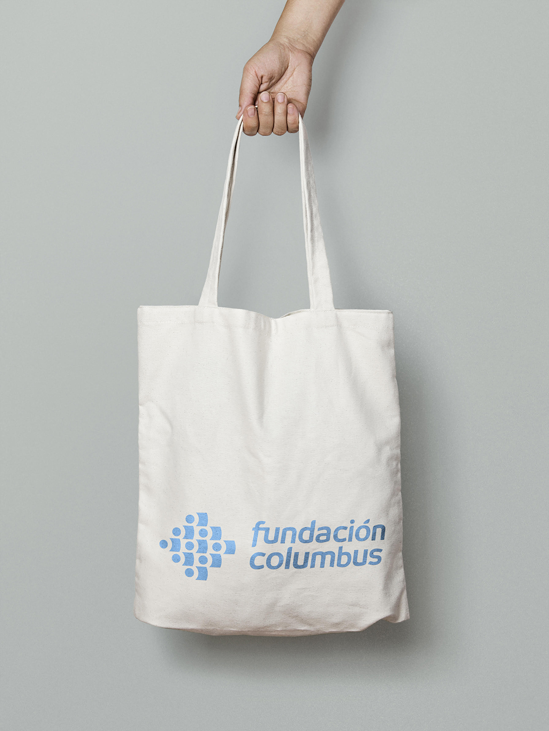
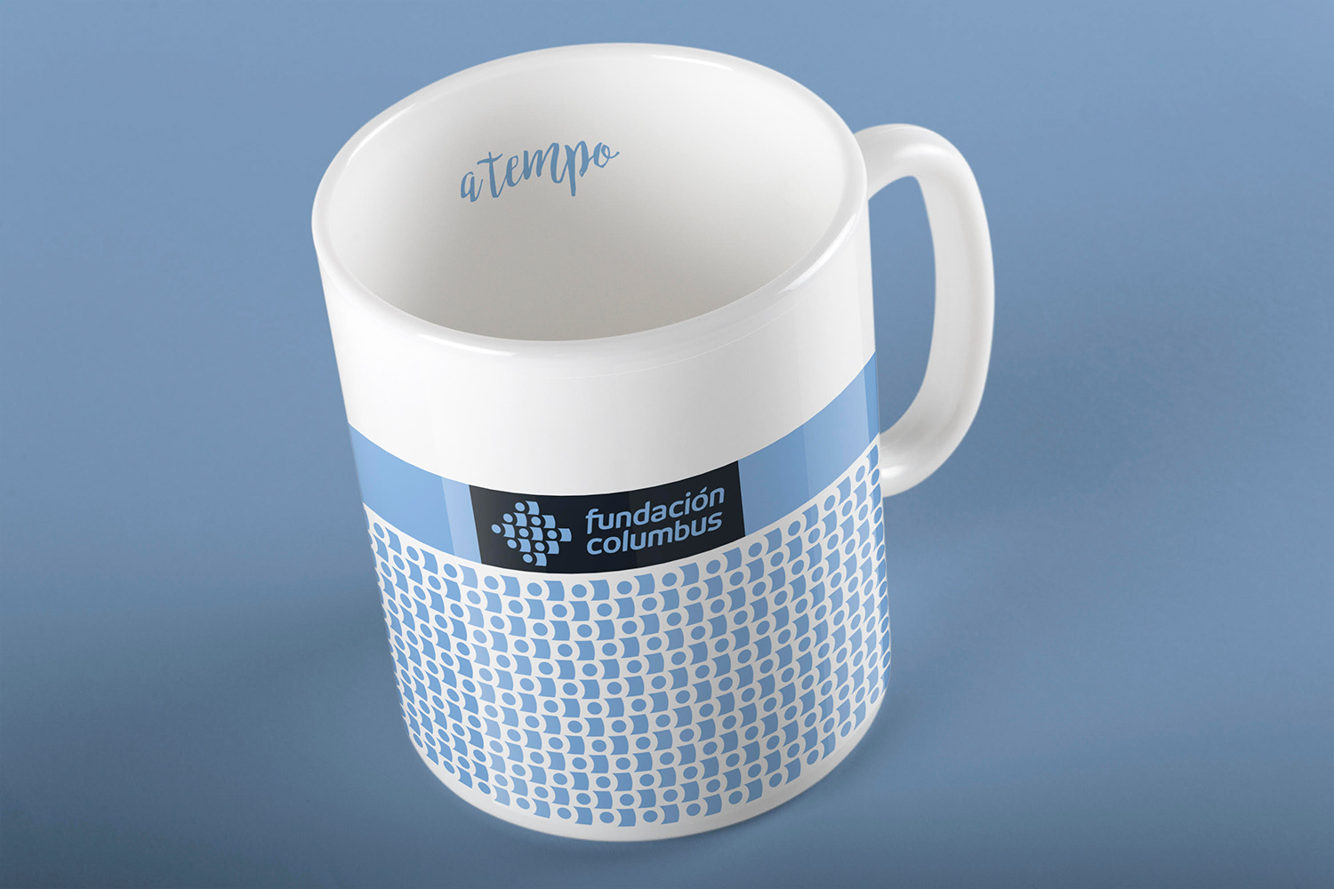
We created a symbol linked to the “Columbus” brand that represents ship’s sails blowing through the wind. At the same time each circle represents the benefited children, the scientists who innovate, the musicians who promote the culture, and each person who contributes with their effort and donations to the Foundation. We wanted everyone to feel identified and integrated into the project, as each of them is key.
Additionally, the brand was produced with a predominately curved, lowercase font and, gives it a human, close and professional character. Its slight forward inclination creates the sensation of movement and advance.

The corporate color was selected from the range of blues since, psychologically, it transmits confidence, in a tonality that also denotes hope and youth.
We discarded the idea of including the orange and gray colors of the parent company, Columbus Venture Partners, as this blue would transmit with more strength the values and mission of the Foundation.
We took the initial work to facilitate the expansion of the Foundation into the USA. All elements have been translated but the essential design is there and it is all part of the same brand.


1. to heal 2. to enjoy the culture 3. to innovate
Because music would be the guiding thread through which the Foundation goals would disseminate and funds would be raised, we thought of a musical term that synthesizes all that spirit and the need to arrive on time to save children affected by cancer and rare diseases.
All the actions of the Foundation, including its concert tour, would be headed by the expression: A TEMPO.
Simple, intuitive and memorable. Applicable to everything, from the tour of concerts organized by the Foundation (“A TEMPO, Il Soldato & Friends”), to scientific conventions, from the announcements, to the web,… a simple, but intense, expression which can be perceived intuitively..
We defined the voice tone, the type of images, the distribution of spaces and everything that allows connecting with different targets.
The images of people would be the main theme, both the main characters of children´s stories and their families, as well as artists and scientists.
We decided to do it this way because to awaken empathy, there is nothing more effective than to appeal to the mirror neurons of the brain, which allow us to link and identify with other´s feelings.

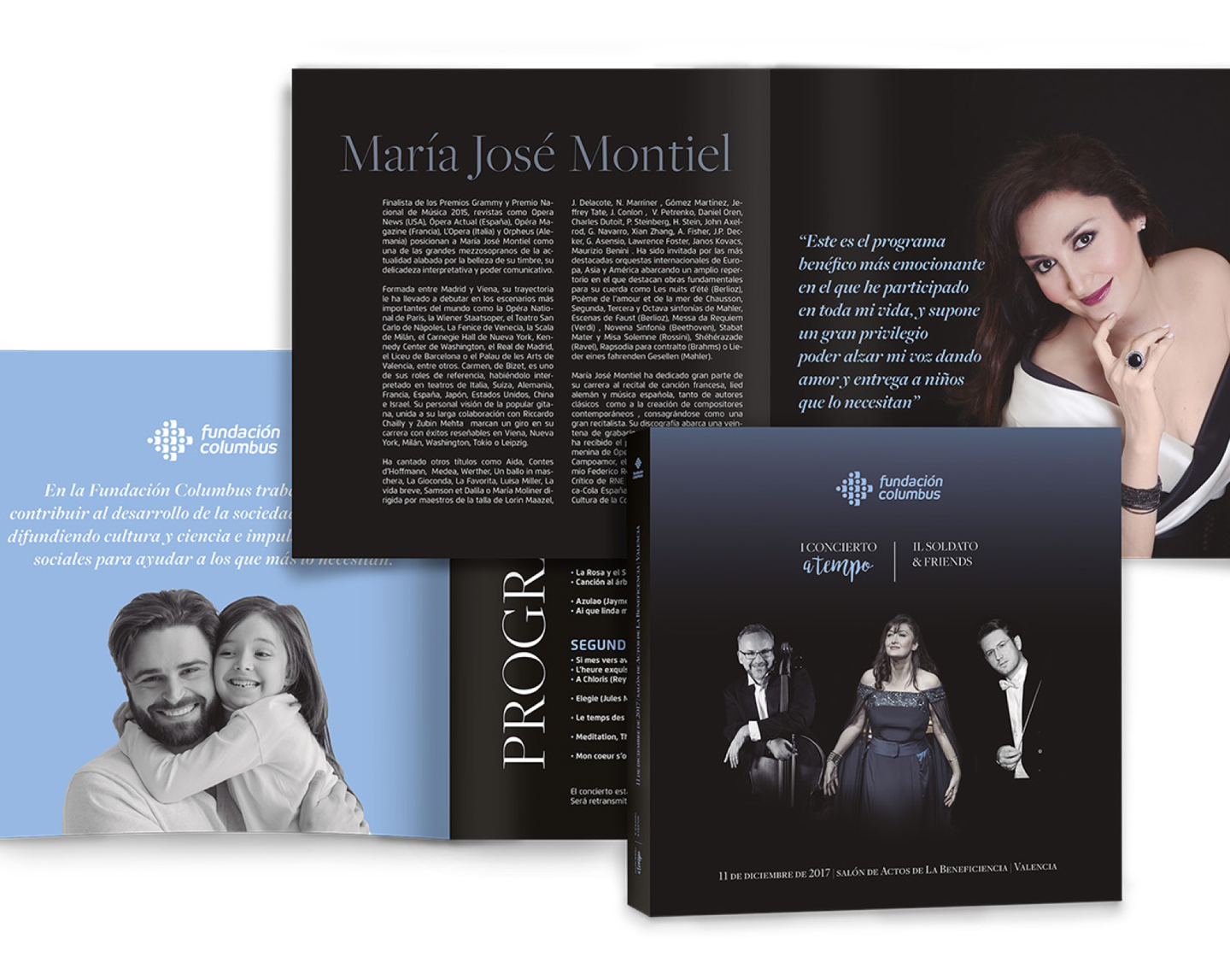
Example of the aesthetic coherence that facilitated the brand identity during the opening concert.
Playbill and stage setting at the selected venue.
A comprehensive branding strategy not only achieves a powerful communication and brand image, but it also saves organizations a huge effort in reaching their goals.
To keep an empathic connection with the client and acting in a timely manner in the development process is reflected in the strength of the brand.